
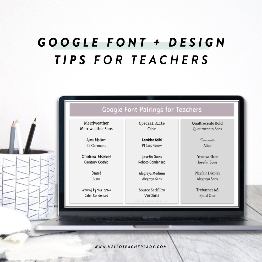
The Best Google Font Pairings + More Design Tips for Teachers
If you’ve ever been frustrated by the lack of options in Google’s font library, you’re not alone.
As a self-proclaimed font nerd, it’s one of my biggest frustrations when working in Docs or Slides. Since Google does not allow the importing of custom fonts, we’re limited to whatever Google has to offer in its collection.
While I’ve been known to work around this by creating a heading or some other design in PowerPoint, saving that as an image file, and then uploading the image to Google Doc or Slides, it’s not always a feasible (or necessary, let’s be honest) option.
There’s some good news though!
The fonts that appear in your font dropdown are actually just a fraction of the available fonts in Google’s font collection, and it’s super easy to add more.
While it’s still no substitute for my precious Mollie Jo or A Perfect Blend fonts, you might be surprised at what Google’s catalog has to offer.
Here’s how to access the Google Font Library:
Open a Google Doc, Slides or Sheets file.
Click the font dropdown below the file menu.
Select “More Fonts.” This launches a popup where you can browse all available Google fonts and select which fonts display in your dropdown.

The thin column on the right shows all the fonts in your personal library; these are the ones that show up when you click your font dropdown in Docs or Slides.
The main column shows all available Google fonts. The ones already added to your library are indicated by a blue checkmark.
If you see a font you like, click on it. It will appear in your font dropdown when you click the OK button.

To filter the catalog by things like font type, popularity or recently added, click one of the dropdown menus at the top.
To search for specific font names, use the search bar on the top left.
Click here to watch a 30-second video demonstrating the steps above.
Here’s how to Use the Extensis Add-On:
You may also be interested in an add-on for Docs and Slides called Extensis.
It doesn’t contain any additional fonts beyond what’s in Google’s library, but it does give you an easy way to preview what a font might look like in your document.
To download Extensis:
Click the Add-on dropdown on the file menu in Docs or Slides and select Get Add-ons.
Type Extensis in the search bar and click Install.
To use Extensis:
Close out of the popup and click the Add-on dropdown again. You’ll now see Extensis appear as an option.
Click Start. This will launch a sidebar showing all fonts in Google’s catalog.
Highlight the text you want to change, then click any font on the sidebar to preview what it would look like.
Close out of the sidebar when you’re done. The font you selected will now appear in your personal font dropdown as well.

Here are my favorite Google font pairings:
Now that you know all about Google’s extended font library, below are some of my favorite, tried-and-true font combinations.
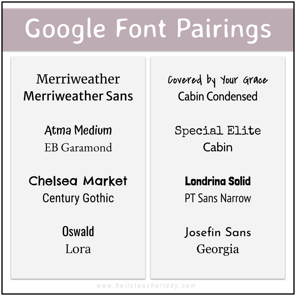
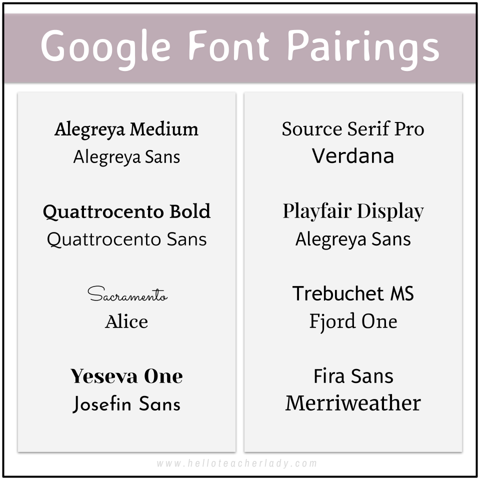
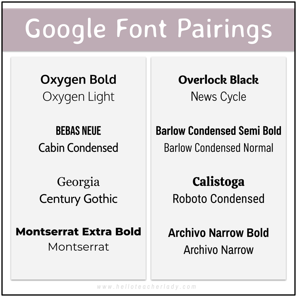
Note: I use the top font in each pairing above for titles/headings and the bottom font for body text.
Lastly, here are a few font pairing + design tips:
To avoid visual clutter, try to limit your font combinations to 2 per resource.
Make sure each font in your resource has a specific function. For example, choose one font for all titles/headings and another for all body text. Be consistent!
“Cute” fonts belong in titles and headings only (but even then, make sure the letters are easily distinguishable for accessibility reasons). Body text fonts should always be plain and easily legible for accessibility reasons as well. When in doubt, choose something else.
When pairing fonts, choose fonts that have both similar and contrasting properties. For example, Londrina Solid and PT Sans Narrow (seen in image 1 above) work well together because they are both relatively narrow, but they also contrast in their thickness.
When in doubt, serif and sans serif fonts usually work well together too.
Hope this helps ease the pain of not being able to find “cute” or aesthetic fonts in Google. Happy designing!
💜 Shana